Lineke contacted me to re-developed her brand and after our brand strategy session, where we discussed her business meaning and goals, I was extremely excited to develop and design her brand.
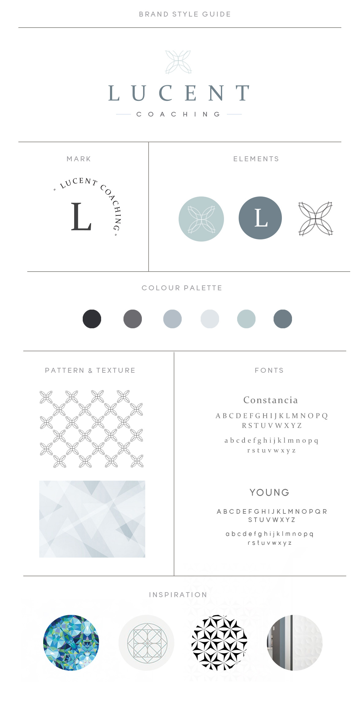
Her business’ name, Lucent, means ”glowing with or giving off light” was the reason for choosing a light blue color palette and adding different color opacities in order to give you that illusion of light. We also took inspiration from the kaleidoscope in the main logo icon design as Lineke compared coaching to the kaleidoscope and how, in coaching, we sometimes encounter a small mindset shift that has a huge impact in our lives and we ‘see’ things differently, as we do with the kaleidoscope